Onboarding / Single Sign On
I was the sole designer alongside a team of business stakeholders and developers, tasked to create a streamlined onboarding experience and single sign-on.
See Live Site (Click "Sign In")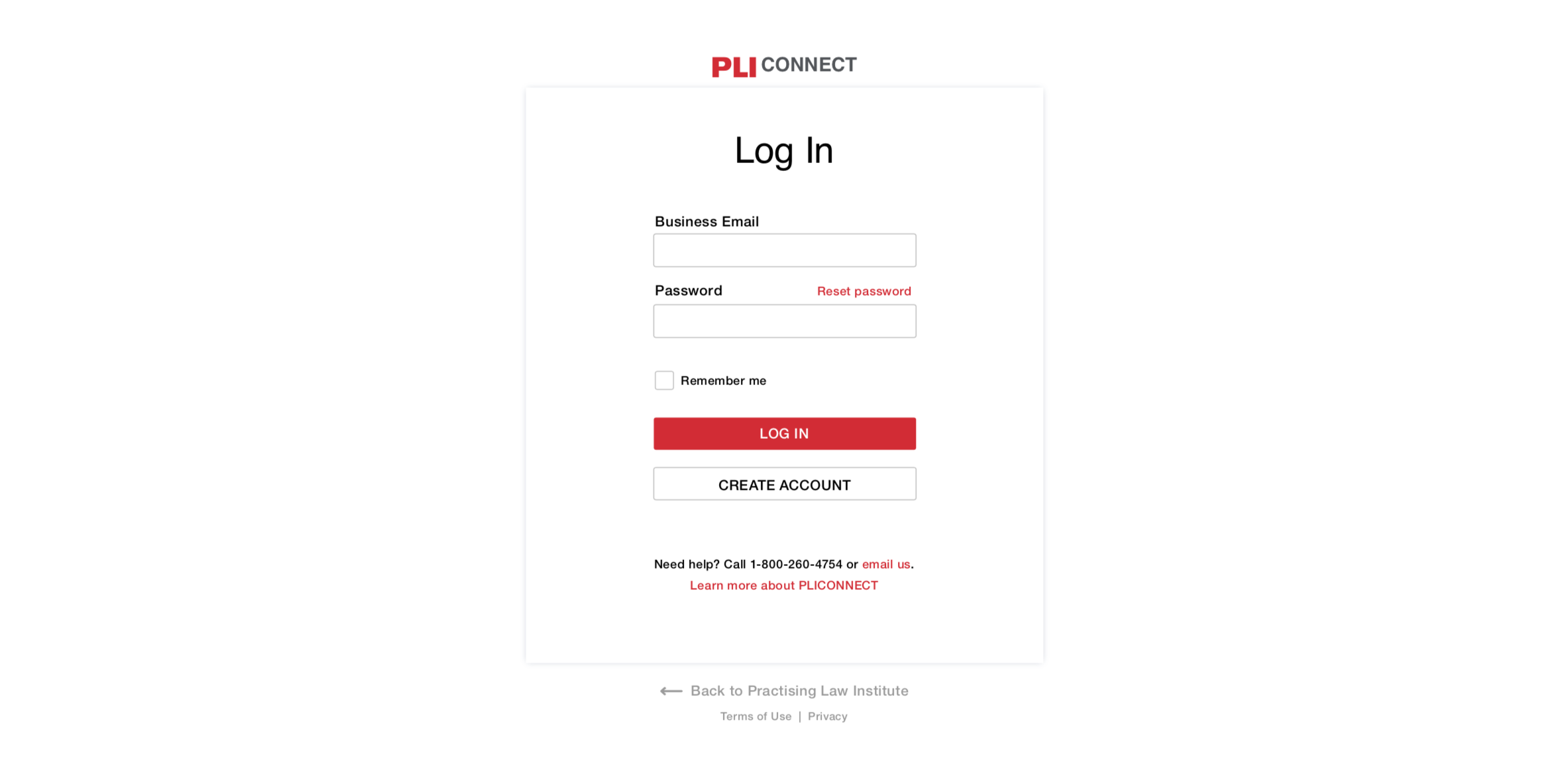
Designer, Art Director and Project Lead
- Art Direction
- UI / UX / Visual / Interaction Design
- Front End Guidance
- Practising Law Institute
- Live: https://www.pli.edu/ --> Click "Sign In"
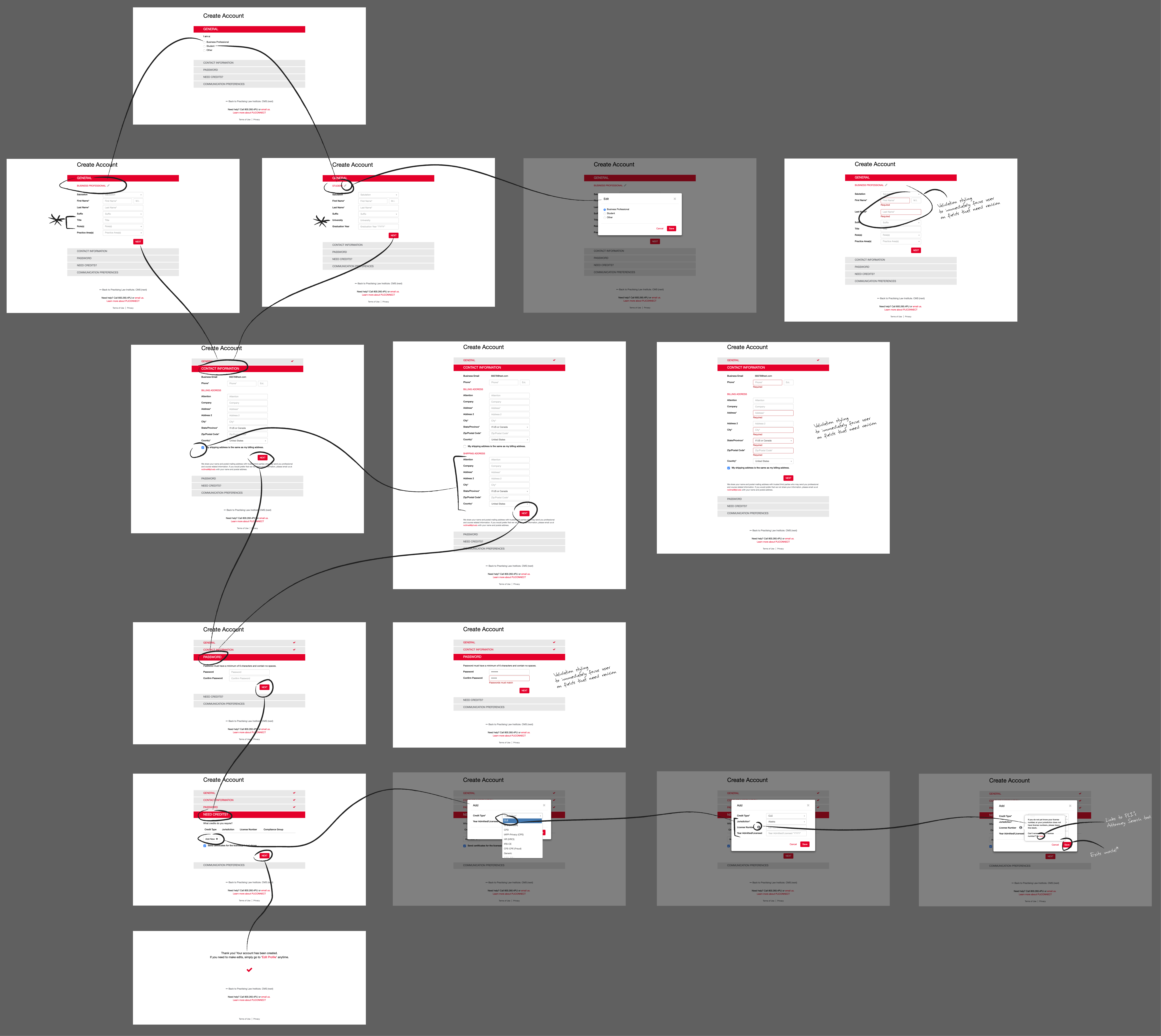
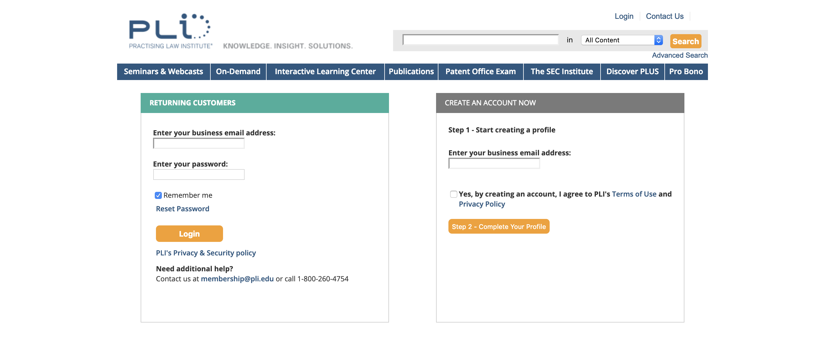
- The previous onboarding experience was a confusing one, with all form fields for different types of users on the same screen. It was time-consuming and difficult to understand and complete.
- No mobile view.
- The branding, color palette and icons were not in accordance with the new brand guidelines.
I looked to streamline the experience by guiding the user through the onboarding process step by step, and NOT displaying everything on one screen. To do this, I first collapsed all accordion panels except the active panel. That allows the user to focus on what's at hand, and so there's a sense of where they're at within the process and how much they have left.
When the user completes the section and is ready to move on to the next, they hit the "next" button. I added validation functionality - so that the user fixes any errors before moving on. This way, the user didn't have to dig through multiple sections at the end to fix errors.
To display relevant fields to their appropriate user, I used a logic tree to make the form dynamic. So when creating an account, the first question is for the user to identify themselves as a "business professional" or a "student", from which the corresponding fields would subsequently appear. For example, with students we have a "university" field, and likewise for business professionals we ask for their "title" and "role" instead.
Then, to create a modern display that would work for various device sizes, I provided desktop and mobile wireframes with specs and suggested we leverage Bootstrap and FontAwesome for development. Specs included notes on applying branding to elements, such as colors for each button state.
Old Interface
New Interface
User Flow